SCOPE
A series of product campaigns for Plooms’ Limited Edition releases and seasonal campaigns. Each campaign highlights the brand’s aesthetic while introducing fresh visual narratives to reflect the unique perspectives.
MY ROLE
ART DIRECTOR
LIMITED EDITION CAMPAIGNS
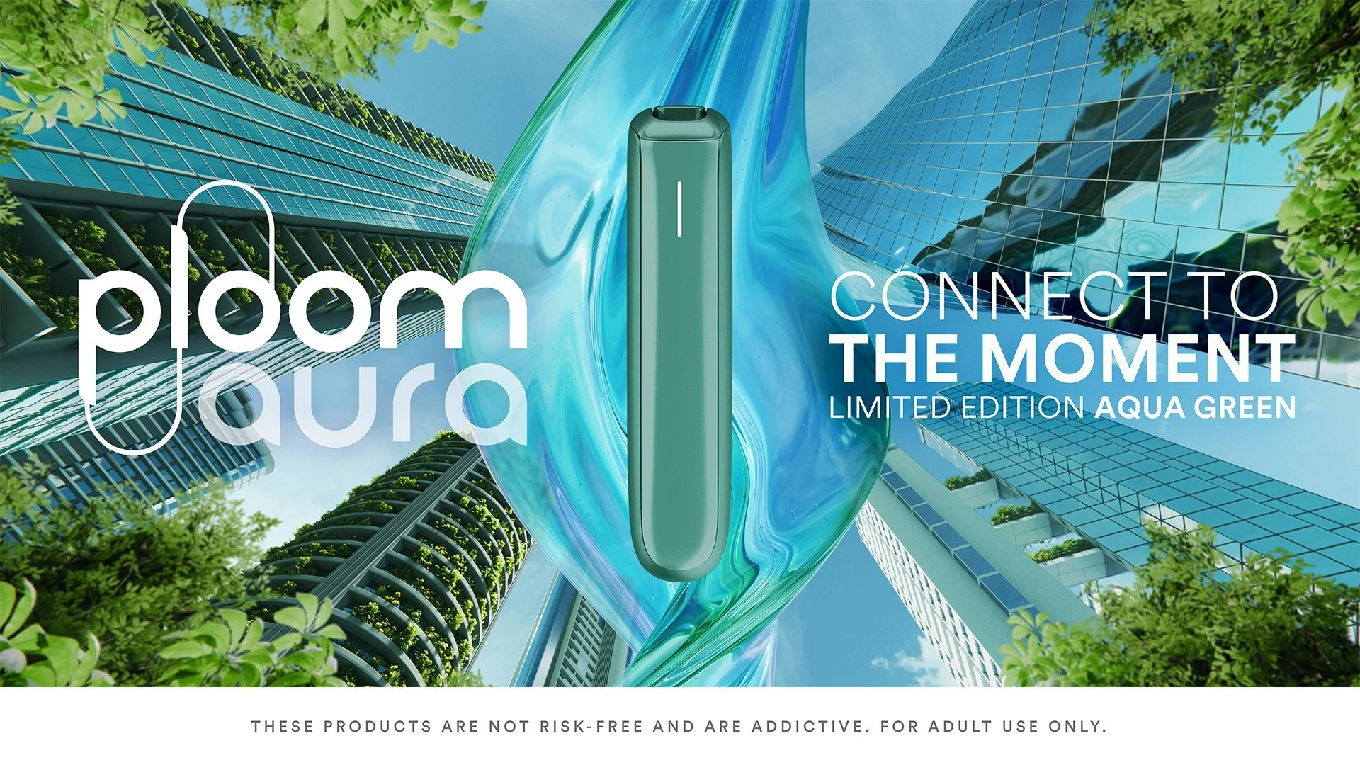
Aqua Green
The limited edition that targets young adults that live in urban areas on a global scale. They like the grind, but they also appreciate nature. In this campaign we incoroporated the key visual elements of the Ploom brand through a dynamic angle and graphic lines of the buildings to draw the eye to the product.
The campaign aims to invite our busy young adults to take a moment to appreciate what’s around you during your consumption moment.
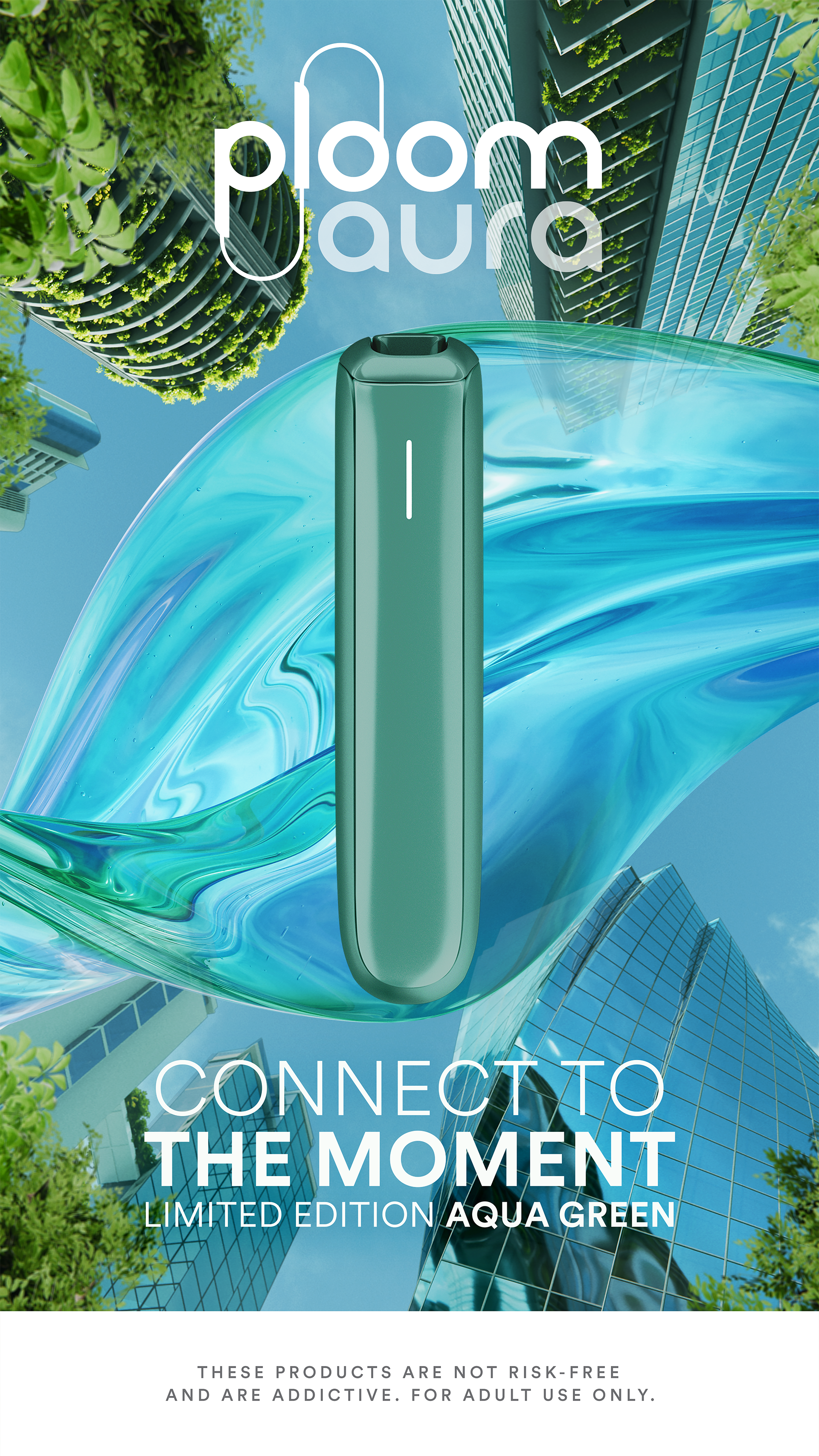
ADAPTATION 9:16
30s VIDEO
Our opportunity to develop our creative idea further by creating a story that takes the viewer from the stress of the start of a work day to a more calm moment.
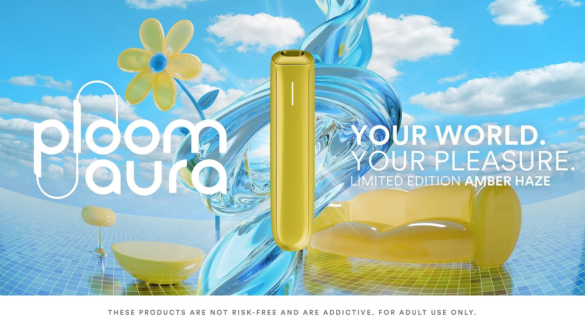
Amber Haze
Amber Haze is a Limited Edition that is only release in the Japan market. Our campaign needed to target the Gen Z of Japan, with a slight preference to a female audience.
To address this target audience we focused on creating a universe that combined both outdoor and indoor spaces, showcasing the fact that Gen Z’s are just as happy at home as out and about.
This campaign invites you to own your world and take joy in whatever brings your pleasure.
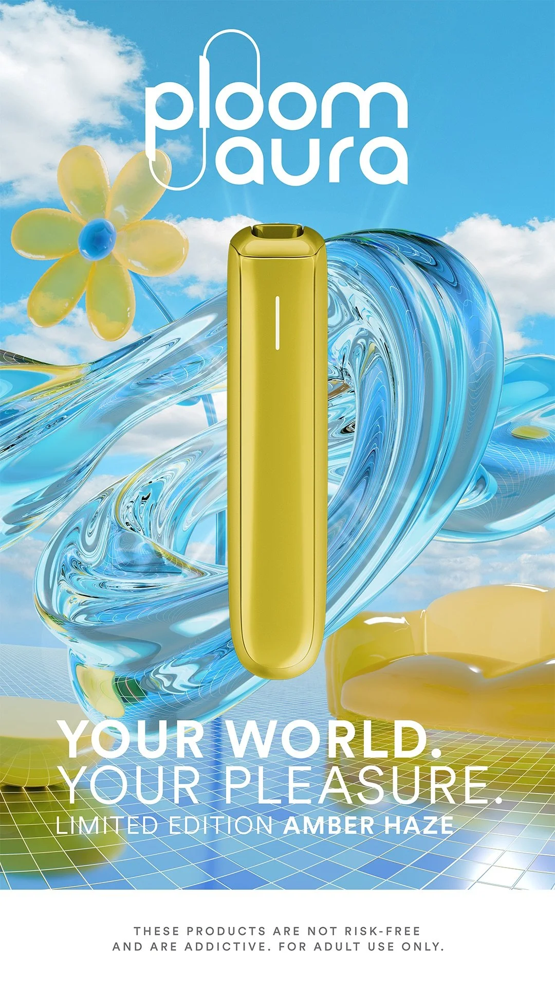
ADAPTATION 9:16
30s VIDEO
Our opportunity to develop our creative idea further by showcasing our target audience creating her own world.
SEASONAL CAMPAIGNS
Spring 2026
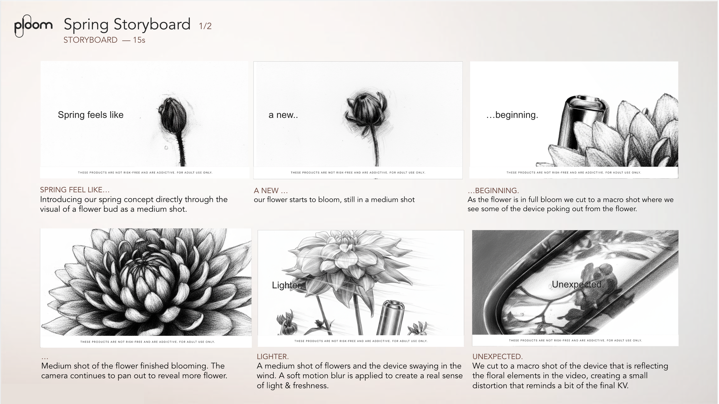
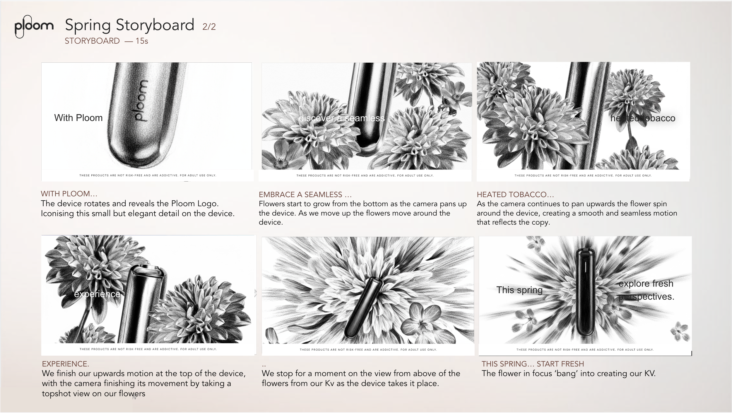
For Ploom’s Spring campaign, we reimagined the season’s iconic symbol—flowers—with a distinctive Ploom twist. Centered on vibrant colors, light textures, and fluid movement, the concept captures the sensorial essence of the brand. Through dynamic compositions and movement, the campaign brings the energy and renewal of spring to life in a fresh, captivating way.
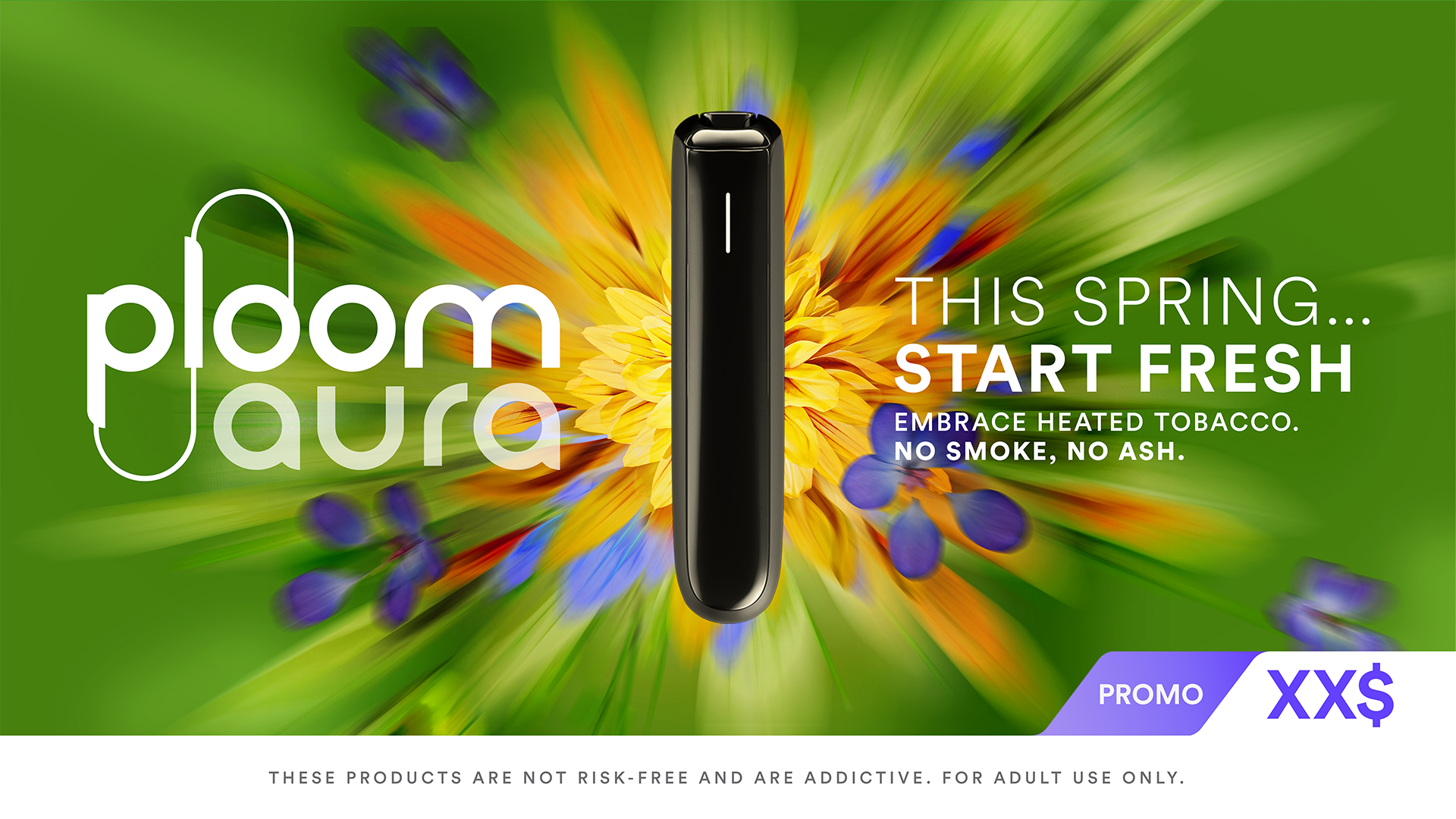
15s VIDEO
These campaigns place the product at the heart of the story. For the accompanying video, we developed a narrative that flows from the first blooms of spring to the final key visual. Between the initial budding and the closing scene, the flowers gradually come to life, growing and unfolding alongside the device—symbolizing renewal and connection.
Created in Photoshop and refined with AI tools, the storyboard—along with mood and styling slides—helped clearly convey our creative vision to the client.